
Region Adjacency Graphs
“Our life is frittered away by detail… Simplicity, simplicity, simplicity! I say, let your affairs be as two or three, and not a hundred or a thousand; instead of a million count half a dozen, and keep your accounts on your thumb nail. In the midst of this chopping sea of civilized life, such are the clouds and storms and quicksands and thousand-and-one items to be allowed for, that a man has to live, if he would not founder and go to the bottom and not make his port at all, by dead reckoning, and he must be a great calculator indeed who succeeds. Simplify, simplify. Instead of three meals a day, if it be necessary eat but one; instead of a hundred dishes, five; and reduce other things in proportion.”
Henry David Thoreau
Region Adjacency Graph (RAG), $G = {V, E}$, is composed of nodes/vertices representing the regions and edges representing the adjacency.
from skimage.future.graph import rag
import networkx as nx
from matplotlib import pyplot as plt
import numpy as np
%matplotlib inline
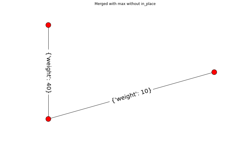
def max_edge(g, src, dst, n):
"""Callback to handle merging nodes by choosing maximum weight.
Returns either the weight between (`src`, `n`) or (`dst`, `n`)
in `g` or the maximum of the two when both exist.
Parameters
----------
g : RAG
The graph under consideration.
src, dst : int
The vertices in `g` to be merged.
n : int
A neighbor of `src` or `dst` or both.
Returns
-------
weight : float
The weight between (`src`, `n`) or (`dst`, `n`) in `g` or the
maximum of the two when both exist.
"""
w1 = g[n].get(src, {'weight': -np.inf})['weight']
w2 = g[n].get(dst, {'weight': -np.inf})['weight']
return max(w1, w2)
def display(g, title):
"""Displays a graph with the given title."""
pos = nx.circular_layout(g)
plt.figure(figsize = (12,8))
plt.title(title)
nx.draw(g, pos)
nx.draw_networkx_edge_labels(g, pos, font_size=20)
"""
=======================
Region Adjacency Graphs
=======================
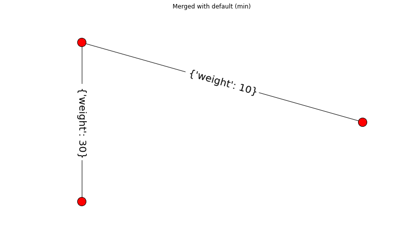
This example demonstrates the use of the `merge_nodes` function of a Region
Adjacency Graph (RAG). The `RAG` class represents a undirected weighted graph
which inherits from `networkx.graph` class. When a new node is formed by
merging two nodes, the edge weight of all the edges incident on the resulting
node can be updated by a user defined function `weight_func`.
The default behaviour is to use the smaller edge weight in case of a conflict.
The example below also shows how to use a custom function to select the larger
weight instead.
"""
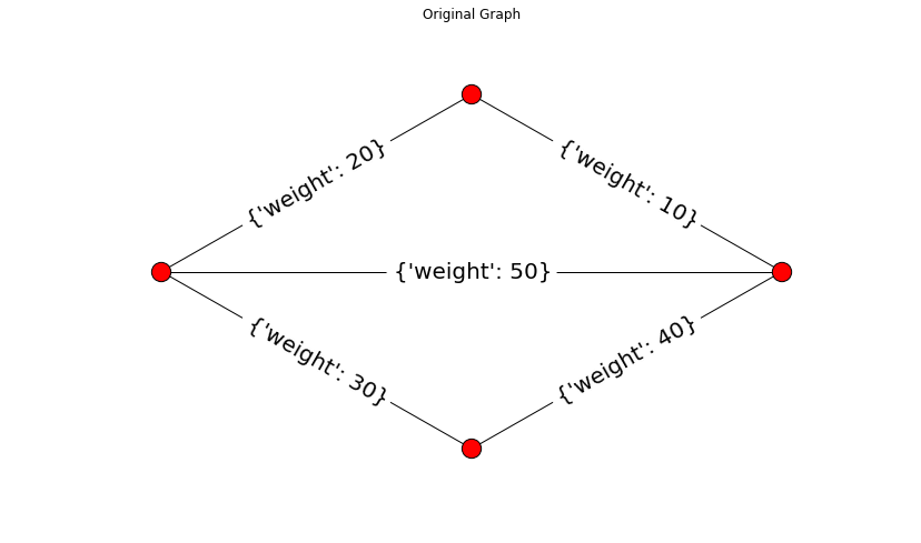
g = rag.RAG()
g.add_edge(1, 2, weight=10)
g.add_edge(2, 3, weight=20)
g.add_edge(3, 4, weight=30)
g.add_edge(4, 1, weight=40)
g.add_edge(1, 3, weight=50)
# Assigning dummy labels.
for n in g.nodes():
g.node[n]['labels'] = [n]
gc = g.copy()
display(g, "Original Graph")
g.merge_nodes(1, 3)
display(g, "Merged with default (min)")
gc.merge_nodes(1, 3, weight_func=max_edge, in_place=False)
display(gc, "Merged with max without in_place")
plt.show()
"""
======================================
Drawing Region Adjacency Graphs (RAGs)
======================================
This example constructs a Region Adjacency Graph (RAG) and draws it with
the `rag_draw` method.
"""
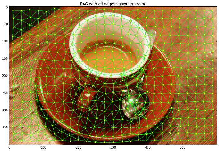
from skimage import data, segmentation
from skimage.future import graph
from matplotlib import pyplot as plt, colors
img = data.coffee()
labels = segmentation.slic(img, compactness=30, n_segments=400)
g = graph.rag_mean_color(img, labels)
out = graph.draw_rag(labels, g, img)
plt.figure(figsize = (12,8))
plt.title("RAG with all edges shown in green.")
plt.imshow(out)
# The color palette used was taken from
# http://www.colorcombos.com/color-schemes/2/ColorCombo2.html
cmap = colors.ListedColormap(['#6599FF', '#ff9900'])
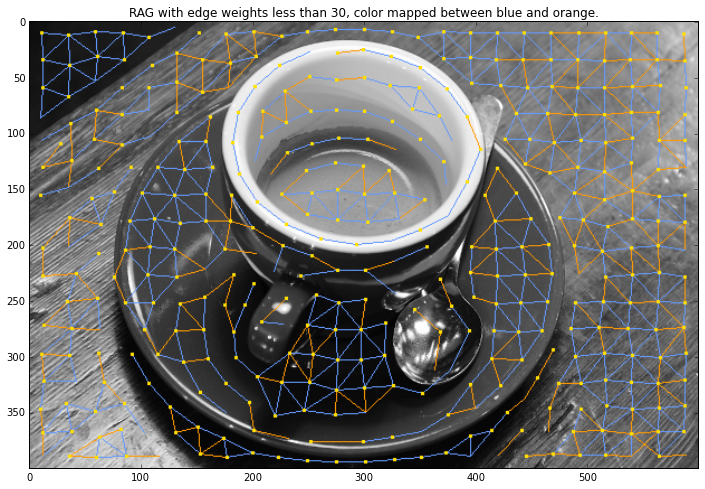
out = graph.draw_rag(labels, g, img, node_color="#ffde00", colormap=cmap,
thresh=30, desaturate=True)
plt.figure(figsize = (12,8))
plt.title("RAG with edge weights less than 30, color "
"mapped between blue and orange.")
plt.imshow(out)
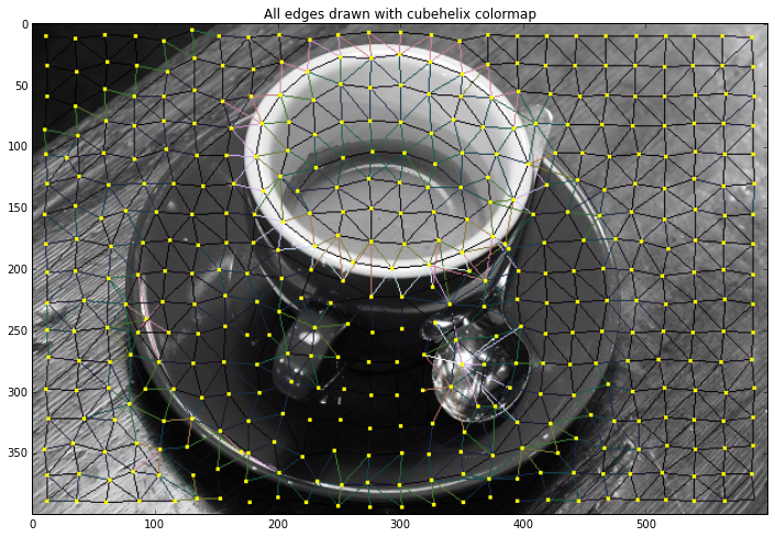
plt.figure(figsize = (12,8))
plt.title("All edges drawn with cubehelix colormap")
cmap = plt.get_cmap('cubehelix')
out = graph.draw_rag(labels, g, img, colormap=cmap,
desaturate=True)
plt.imshow(out)
plt.show()
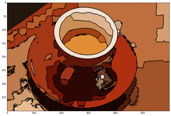
"""
================
RAG Thresholding
================
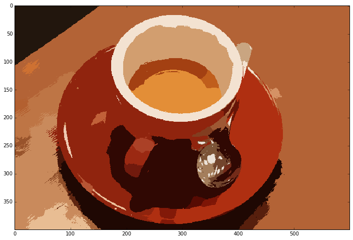
This example constructs a Region Adjacency Graph (RAG) and merges regions
which are similar in color. We construct a RAG and define edges as the
difference in mean color. We then join regions with similar mean color.
"""
from skimage import data, io, segmentation, color
from skimage.future import graph
from matplotlib import pyplot as plt
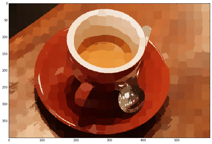
img = data.coffee()
labels1 = segmentation.slic(img, compactness=30, n_segments=400)
out1 = color.label2rgb(labels1, img, kind='avg')
g = graph.rag_mean_color(img, labels1)
labels2 = graph.cut_threshold(labels1, g, 29)
out2 = color.label2rgb(labels2, img, kind='avg')
plt.figure(figsize = (12,8))
io.imshow(out1)
plt.figure(figsize = (12,8))
io.imshow(out2)
io.show()
from skimage import data, io, segmentation, color
from skimage.future import graph
from matplotlib import pyplot as plt
from skimage.measure import regionprops
from skimage import draw
import numpy as np
def show_img(img):
width = 10.0
height = img.shape[0]*width/img.shape[1]
f = plt.figure(figsize=(width, height))
plt.imshow(img)
img = data.coffee()
labels = segmentation.slic(img, compactness=30, n_segments=400)
labels = labels + 1 # So that no labelled region is 0 and ignored by regionprops
regions = regionprops(labels)
label_rgb = color.label2rgb(labels, img, kind='avg')
label_rgb = segmentation.mark_boundaries(label_rgb, labels, (0, 0, 0))
rag = graph.rag_mean_color(img, labels)
for region in regions:
rag.node[region['label']]['centroid'] = region['centroid']
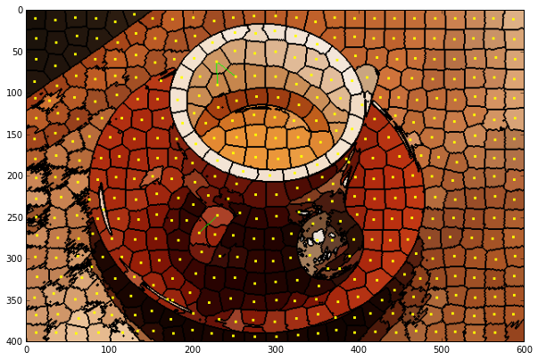
def display_edges(image, g,):
"""Draw edges of a RAG on its image
Returns a modified image with the edges drawn.Edges are drawn in green
and nodes are drawn in yellow.
Parameters
----------
image : ndarray
The image to be drawn on.
g : RAG
The Region Adjacency Graph.
threshold : float
Only edges in `g` below `threshold` are drawn.
Returns:
out: ndarray
Image with the edges drawn.
"""
image = image.copy()
for edge in g.edges_iter():
n1, n2 = edge
r1, c1 = map(int, rag.node[n1]['centroid'])
r2, c2 = map(int, rag.node[n2]['centroid'])
line = draw.line(r1, c1, r2, c2)
circle = draw.circle(r1,c1,2)
#if g[n1][n2]['weight'] < high and g[n1][n2]['weight'] > low:
weight_int = g.node[n1]['mean color'].astype(int) - g.node[n2]['mean color'].astype(int)
weight_int = np.linalg.norm(weight_int)
weight_double = g[n1][n2]['weight']
#print weight_int,weight_double
if weight_int > 30 and weight_double < 30 :
print ("Double Vectors")
print ("Vector 1",g.node[n1]['mean color'])
print ("Vector 2",g.node[n2]['mean color'])
print ("Difference",g.node[n1]['mean color'] - g.node[n2]['mean color'])
print ("Magnitude",weight_double)
print ("Int Vectors")
print ("Vector 1",g.node[n1]['mean color'].astype(int))
print ("Vector 2",g.node[n2]['mean color'].astype(int))
print ("Difference",g.node[n1]['mean color'].astype(int) - g.node[n2]['mean color'].astype(int))
print ("Magnitude",weight_int)
image[line] = 0,1,0
image[circle] = 1,1,0
return image
edges_drawn_30 = display_edges(label_rgb, rag)
show_img(edges_drawn_30)
plt.figure(figsize = (12,8))
plt.show()
Double Vectors
Vector 1 [ 205.07634731 151.04191617 101.55988024]
Vector 2 [ 199.41367521 134.5042735 77.4 ]
Difference [ 5.66267209 16.53764266 24.15988024]
Magnitude 29.8204509233
Int Vectors
Vector 1 [205 151 101]
Vector 2 [199 134 77]
Difference [ 6 17 24]
Magnitude 30.0166620396
Double Vectors
Vector 1 [ 205.07634731 151.04191617 101.55988024]
Vector 2 [ 198.79637378 134.30404463 77.71269177]
Difference [ 6.27997353 16.73787154 23.84718847]
Magnitude 29.8040736968
Int Vectors
Vector 1 [205 151 101]
Vector 2 [198 134 77]
Difference [ 7 17 24]
Magnitude 30.2324329157
Double Vectors
Vector 1 [ 171.43289474 65.31973684 39.33552632]
Vector 2 [ 156.7818854 45.54158965 22.39371534]
Difference [ 14.65100934 19.77814719 16.94181097]
Magnitude 29.8806315217
Int Vectors
Vector 1 [171 65 39]
Vector 2 [156 45 22]
Difference [15 20 17]
Magnitude 30.2324329157
<matplotlib.figure.Figure at 0xadddfc6c>


"""
===========
RAG Merging
===========
This example constructs a Region Adjacency Graph (RAG) and progressively merges
regions that are similar in color. Merging two adjacent regions produces
a new region with all the pixels from the merged regions. Regions are merged
until no highly similar region pairs remain.
"""

from skimage import data, io, segmentation, color
from skimage.future import graph
import numpy as np


def _weight_mean_color(graph, src, dst, n):
    """Callback to handle merging nodes by recomputing mean color.
    The method expects that the mean color of `dst` is already computed.
    Parameters
    ----------
    graph : RAG
        The graph under consideration.
    src, dst : int
        The vertices in `graph` to be merged.
    n : int
        A neighbor of `src` or `dst` or both.
    Returns
    -------
    weight : float
        The absolute difference of the mean color between node `dst` and `n`.
    """

    diff = graph.node[dst]['mean color'] - graph.node[n]['mean color']
    diff = np.linalg.norm(diff)
    return diff


def merge_mean_color(graph, src, dst):
    """Callback called before merging two nodes of a mean color distance graph.
    This method computes the mean color of `dst`.
    Parameters
    ----------
    graph : RAG
        The graph under consideration.
    src, dst : int
        The vertices in `graph` to be merged.
    """
    graph.node[dst]['total color'] += graph.node[src]['total color']
    graph.node[dst]['pixel count'] += graph.node[src]['pixel count']
    graph.node[dst]['mean color'] = (graph.node[dst]['total color'] /
                                     graph.node[dst]['pixel count'])


img = data.coffee()
labels = segmentation.slic(img, compactness=30, n_segments=400)
g = graph.rag_mean_color(img, labels)

labels2 = graph.merge_hierarchical(labels, g, thresh=40, rag_copy=False,
                                   in_place_merge=True,
                                   merge_func=merge_mean_color,
                                   weight_func=_weight_mean_color)

g2 = graph.rag_mean_color(img, labels2)

out = color.label2rgb(labels2, img, kind='avg')
out = segmentation.mark_boundaries(out, labels2, (0, 0, 0))
plt.figure(figsize = (12,8))
plt.imshow(out)


<matplotlib.image.AxesImage at 0xadd73b2c>
References:
[1] Vighnesh Birodkar. https://vcansimplify.wordpress.com/2014/07/06/scikit-image-rag-introduction
[2] scikit-image Examples. https://github.com/scikit-image/scikit-image/blob/master/doc/examples